
70% of dealers working with MotorK indicated that focusing on the homepage was a priority: adding, removing, or modifying certain elements is essential to make the dealership’s key information more usable and to update it according to the priorities of their business.
In this post we will look at best practices for effectively building and customising your dealership’s homepage with WebSparK – the web platform developed by MotorK that comes complete with all the features you need to have a digital showroom that is always up to date, starting with the key elements that make it up: navigation menus, widgets, and chat.
THE NAVIGATION MENU, DIFFERENT LAYERS DIFFERENT PRIORITIES
The experience of the visitor should be frictionless and the click-through process should be simple and intuitive. The aim is to avoid a high percentage of users leaving the site after visiting a single section without taking any action. The more user-friendly the site is, and the more attractive and comfortable it is to explore, the higher the retention rate will be. But what is the first tool a user employs when landing on a site? The navigation menu. A guide that allows you to move within the different sections and that, in order to generate leads, must focus on the navigation experience – or User Experience – of those who land on your page.
As for the types of menu available with WebSparK, which vary according to the positioning on the page, here are some use cases:
- the main menu, in the foreground of the header, the navigation possibilities related to the dealer’s offer are clearly and promptly displayed, usually headings related to cars for sale or rentals: ‘Used”’, ‘New’ and ‘Km0’ as well as ‘Promotions’ and your ‘Contacts’;
- the service menu, in the desktop version located at the top of the header. This is the ideal section for commercial collateral items such as ‘About us’, ‘Staff’, ‘Private area’ or ‘Social’, especially if your dealer offers various products and services that are already shown in the main menu. In this section you can also convey any contact links such as ‘Email’ and ‘Phone’. However, we recommend using the ‘Quick Contacts’ widget for this type of action as it is more effective given its visibility from both mobile and desktop, as opposed to the service menu, avoiding repeating the same contacts in both positions will make the page less overcrowded with attention points, allowing the visitor to focus immediately on those needed;
- the brand-dedicated homepage menu, may meet different criteria depending on the range of offers available at your dealership and on the brand;
- the network menu, used to link other platforms such as the dedicated site of your rental service;
- at the bottom of the page we can find the footer menu, often used to replicate items from the main menu or for useful but less sought-after information such as the ‘Work with us’ / ‘Careers’ section.
Regardless of the type, we recommend these 5 tricks for structuring and maintaining a functional menu:
- it must be simple, comprehensive and organised: headings must be short, direct and intuitive. Copy must clearly indicate where the user will land once they click;
- pay attention to the order, it is preferable to put the most important sections at the beginning since western culture has accustomed us to reading from left to right;
- only include sections that are really relevant to the business and the buyers;
- avoid too many navigation options, with less information on the display, it gives the eyes time to grasp the most relevant ones. A concise menu is important to avoid going over two lines in smaller desktop screens such as those of a tablet or smartphone, so it is a good idea to group the various secondary hubs under general headings, which will be visible in the second-level menu;
- do not overdo the sub-menu levels in order not to make navigation too complex.
HOW TO MANAGE HOMEPAGE WIDGETS
Let’s start with a definition of widget. In the programming field, this term refers to independent graphic and dynamic blocks of content that allow text, links and visual and interactive features to be added to a site visitor’s experience.
WebSparK’s widgets can be embedded in different areas of the site and customised (created, modified, activated, moved) easily via the backend area. Let’s take a look at some practical examples, useful for a dealer’s digital shop window:
- the Hero Slider, allows you to browse in ‘carousel’ mode a series of promotions consisting of images and text. Useful for conveying particular dealership initiatives or promotions;
- the product range, the configurator, which allows visitors to preview models from the dealership’s official brand range and then, once the model has been selected, to access its configuration;
- the stock search widget, facilitates in-stock car searching: the user can filter by ‘New’, ‘Used’, ‘km0’, ‘Make’, ‘Model’, ‘Body type’ and ‘Price range’ directly on the homepage;
- stock showcase: displays a selection of vehicles from the fleet that are configurable by different parameters – such as Used and Km0 – and allows you to select different types of cards based on the vehicle details you wish to display, such as fuel consumption, mileage, registration, and price;
- postcard article section: through the navigation of different card types this widget will inform about promotions, news, services or important announcements such as the change of showroom opening hours.
- quick contacts, is the widget that promotes interaction between users and dealerships through different forms of contact – phone, email, WhatsApp, chat – embedded in the page, both desktop and mobile, it follows the potential customer during their browsing so as not to miss a single lead generation opportunity.
It doesn’t take much for a user to leave a website, whether it’s the lack of engagement or content that doesn’t match what they are looking for. We would therefore like to give you a few tips on how to create a homepage that gives your website visitors a positive experience:
- excessive information usually means poor navigation: 5 or 6 is the maximum number of widgets we recommend in order to make mobile navigation a smooth experience;
- foresee call to action easy and quick to reach;
- highlight the competitive value of your dealership and its uniqueness;
- to gain credibility with search engines, and finally, place editorial widgets to improve organic ranking.
Thanks to lazy loading feature, the elements on the WebSparK homepage are only loaded when the user actually needs them, so navigation is smoother and faster.
CHAT: REAL-TIME COMMUNICATION BETWEEN DEALER AND CUSTOMER
Consumers are more likely to buy from a company with whom they find it easier to communicate. A research by Forrester-Google reveals that chat and messaging are becoming increasingly popular and appreciated, especially among the younger generations.

What does this mean for dealers? Implementing a messaging tool, certainly, but taking into account certain factors that can contribute to a more satisfactory service:
- chat is a winning tool if you can respond in real time, otherwise you risk losing a potential customer;
- It is best to keep it switched off if you are unable to answer;
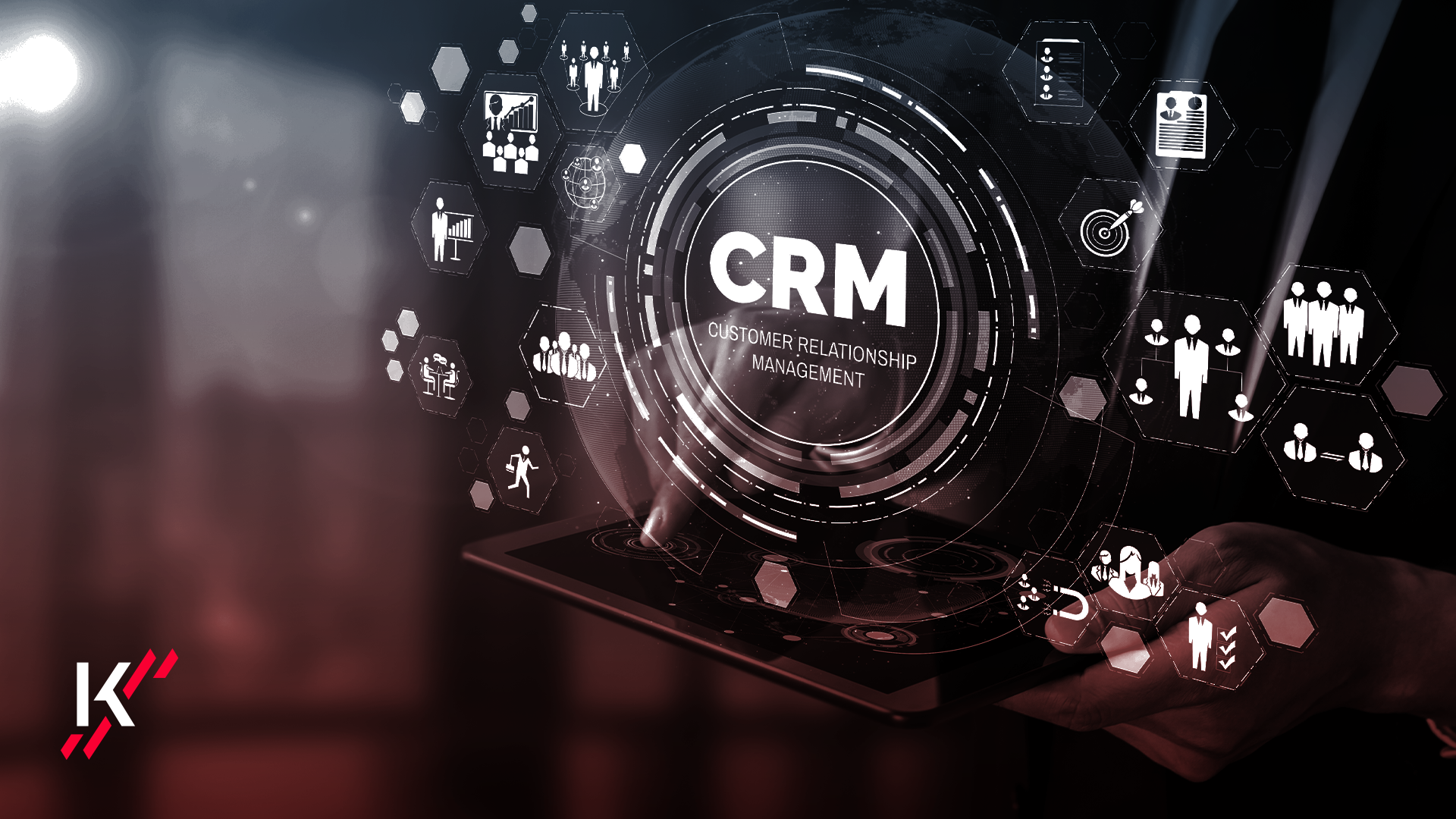
- chat generates an interaction, the operator’s task is to move the conversation to a telephone call, sell an appointment and survey the lead within the CRM.
MotorK has integrated specific solutions within WebSparK, built to meet the needs of dealers who wish to engage in a real-time conversation with their website visitors.
The effectiveness of a successful homepage is not just a question of design; a large part of the work lies in creativity, in the sense of freshness, the ability to improve and innovate, attracting the attention of users and communicating your offer without stretching it too far, but at the same time without leaving out the genuinely important information. Making content and sections easy to read is the foundation for ensuring that visitors continue to explore your website in greater depth.
Beware, however, of paying as much attention to desktop use as to smartphone use. We Are Social data reveal that 5.22 billion people worldwide now connect to the internet via mobile, and this figure is only set to grow. It should be noted that from March 2021, Google search results will give priority to websites designed for mobile use.
Giving your customers a high quality mobile experience can make all the difference in terms of sales and retention.
Check out the must-have elements on your mobile homepage!